Data visualization fundamentals
Why data visualization?
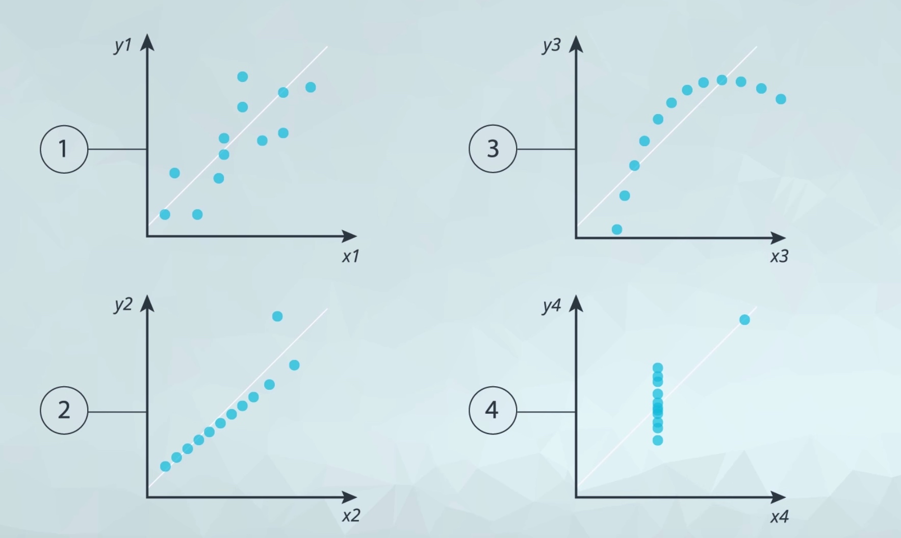
Anscombe's quartet
Univariate Plots
- quantitative variable
- categorical variable
Multivariate Plots
- quantitative vs quantitative
- quantitative vs time
- categorical vs categorical
Hierarchies & Filters
Small Multiples
Groups & Sets
Calculated Field
Table Calculation
Double Encodings example
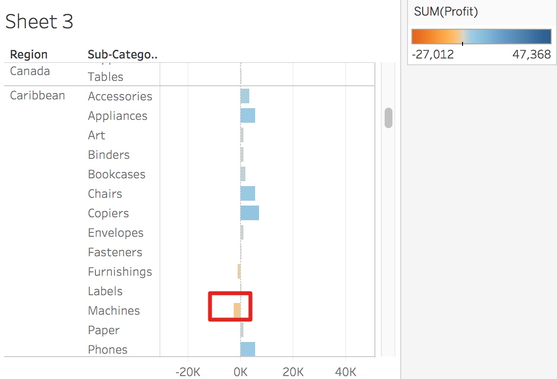
It is very easy to identify the negative one.
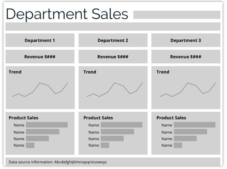
How to design a dashboard step by step?
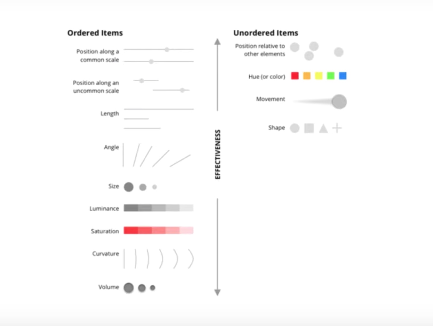
Identify Graphicacy
Low
Medium
- Dual axis
- Scatter plot
- Cumulative measures
- Heat map
High Graphicacy
- Radar
- Tree
- Network
- Error bars (a series of boxplot)
- custom
Visual Hierarchy
Wireframing
You can design wireframe before building dashboard or derive a wireframe from an existing dashboard.
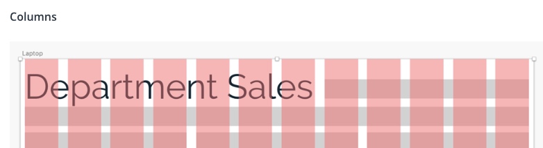
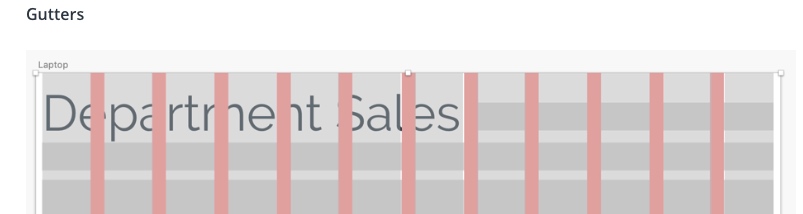
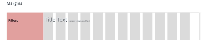
Layouts
- Columns (12 even space for flexibility)
- Gutters
- Margins (eg., filter space to the left and blank space to the right)
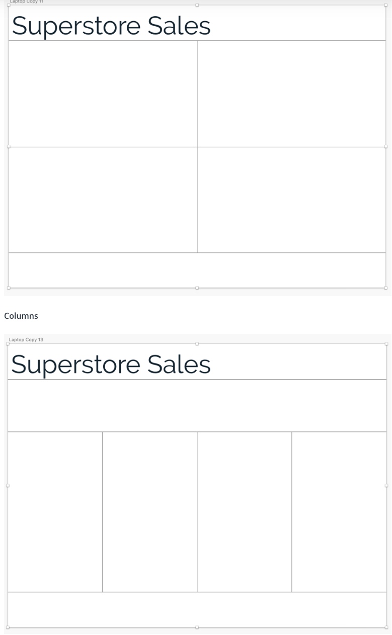
Common layouts
- Quadrants
- Columns
- The Golden Ratio
Alignment